

DIRECTOR’S LOOKBOOK
how can you live if you can’t live with
YOURSELF?
A drag queen haunted by addiction must battle intrusive hallucinations to nail a life-changing performance.
genre
Crystalline is a pulpy, fast-paced character drama with elements from both psychological and supernatural thrillers, with a light reference to Italian giallo films.
style
The style of the film will evoke a sense of unease and unreality, using photography and editing to emphasize Corri’s loosening grip on reality. In hallucination sequences the editing will be more impressionistic and stream of consciousness which will contrast the “real world” scenes early in the film that will be much more pedestrian. Camera will be handheld until the end of the film, where Corri begins to find his truth.
tone
The tone of the film is tense, foreboding, and somber. This is balanced by quiet, existential moments of spirituality. Tonally we find the eye of the storm near the end of the film - a place of quiet where Corri experiences an awakening. This should carry a sense of sublime.
genre, style, and tone


sound
Score and sound design will evoke a propulsive, mysterious, turbulent atmosphere. We will create a soundscape inspired by the conventions of our genres and include specific elements like shimmering crystals and unintelligible whispers. Creative sound design will magnify the sense of unreality in the hallucination sequences, and the rich environmental sound design of The Boa will immerse us in Corri’s club world.
score
The score will draw from Corri’s favorite eras of music, including 80’s punk, 90’s club music, and classic hip hop. We’ll combine music tracks from various artists with a custom score that combines analog and electronic elements, as indicated on the Crystalline mood playlist with score work from Disasterpiece and Ben Salisbury.
playlist
The camera will underscore the turbulence of Corri’s experience with handheld movement with a notable level of motion. We’ll use specifically designed transitions and motions in the hallucination sequences to tell the backstory of Corri’s world before the first scene in the park.
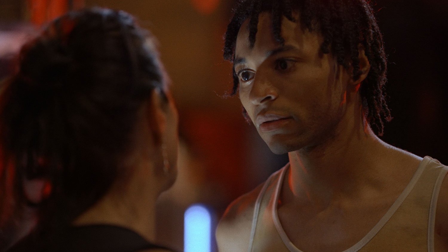
We’ll use camera angle to emphasize the authority that Corri feels Vic and Gideon both have over him when he’s inside his hallucinations. In the “real world” these differences will be less pronounced.
Much of the framing in the Red Void will be claustrophobic and tight, emphasizing the lack of freedom Corri feels while highlighting performance. Anamorphic lenses throughout will emphasize the environment Corri is in - from the emptiness of the void to the dinginess of the bar’s backroom to the vibrancy and liveliness of the main bar. In specific moments, we’ll go to very wide angles to emphasize Corri’s loneliness and isolation - the film will be bookended with extreme wide shots. The film opens with an extreme wide of Corri in the void, and closes with an extreme wide of Corri triumphant as Crystal.
Scenes in the real world will follow more traditional framing conventions with medium and medium close shots. Near the end of the film, the camera movement becomes more stabilized with tracking, dolly, and tilt/pan shots - this communicates the stability and certainty Corri finds.

camera


The film's climax will use more medium and wide shots to juxtapose Corri’s newfound truth with the loneliness and isolation that brought him there. We’ll contrast these shots with intimate, shallow frames of Corri/Crystal that should emphasize her emotion. Medium shots will allow us to showcase Crystal and her look. Together, a dynamic approach to framing and steadier approach to motion will create a sense of reality and groundedness.

The film will feature prominent reds, blues, and turquoise/green hues - with neutral, magenta, cyan or yellow accents throughout. Overall lighting strategy in the bar and park has an overhead key with colorful fill from left or right side, and a colorful edge or halo light.
In the red void, we’ll get ambient spill on talent in red, with a neutral softer key overhead with slight wrap onto the face.
In the bar backroom, we’ll have cooler colors and lighting, and again use an overhead key.
The environment of the bar will be the most colorful, with club lights during drag performances and vibrant accent lights during earlier dialogue scenes. In Crystal’s final performance, there is an opportunity to bring in additional colors of accent lights.
summary: lighting and color palette
test shoot post-mortem, lighting design, and overall vision
The Bar Backroom
Test Shots

Lighting
These test shots are using on location pracitals only. We are looking for more overhead key lighting with wrap enough to catch some of the eyes. We want less light on the walls and more on the talent. This is a place where Corri feels medicalized, scrutinized, interrogated - lighting should reflect that. Too naturalistic/documentary in test shots, more narrative look desired. Recommend attenuating the practicals (or exposing down) and adding overhead light, catching more eyes. Need eyelight/pinlight as well. Want to be able to push the contrast, focus on the talent and the faces, and push the environment into the background.
Color
Had a difficult time in the grade isolating skin tones in order to make the look work. Skin tones and tones of the walls were very similar. We need to make the camera see the skin and the walls as separate hues as much as possible. Possible solutions: Attenuate the warm practicals + add overhead cool. These quick grades in the test shots look a little sickly - see inspo for more accurate goal.
Look Inspiration

Main Bar Area
Test Shots
Lighting
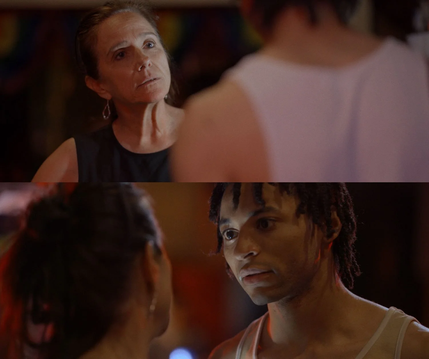
This is only practicals and one small portable lightbox placed on the bar (the white/neutral side light.) Lot of good play from the location and practicals but looking to elevate these shots more - Maybe we do a blue edge/rim with a little wrap on them. Neutral key, red fill. The practicals will also add red accents as seen in these tests shots on Corri’s ear, neck. Would like to play up the color. Overall this is a good foundation for the lighting and look, it contrasts with the top down directionality of the void and the backroom - this main area of the bar represents creativity, cohesion, catharsis - so a different look is motivated.
Color
Color accents in the background or as edge lights would be great. We want to evoke the club environment with multiple hues. Pushing up the saturation on Vic/Carol just made it look muddy, so let’s be intentional with what temperature is the key (neutral cool?) what is the fill (warm/red?) and what is the edge or accent (blue or green?) Open to ideas here.
Fernando: Some of the shots you sent over via text in the bar and backroom were overall too dark (realizing they were applied LUTS). I am looking for more legibility in the images and investment in our mid and lows to really capture a full range of values and/or enough light use to produce legibility in the image so we can really read performance. If we ned somewhere in the middle of the test shots and the inspo shots in terms of contrast, we’re good.

Look Inspiration


Note the use of light and hue to carve out the figures. I am looking to wash areas of the image with certain colors (open to what those are, reds and greens to pull forward the two environments of the bar backroom and the red void) - to create an overall graphic impression of the image. Then we can add halo, edge and side lighting in different hues. Overall, we are looking for a soft key/fill and some harsher more colorful accents in directional and edge lighting.
Main Bar Area - Performance
Test Shots


Lighting and Color
These test shots were lit with on location practicals only. The bar has several arrays of club lighting that can be directed to various locations. The images that result are a little overlit and under lit. Bit muddy and one note in terms of color. We need to work to shape the light and mood of the performance sequence in the main bar area. See look inspiration below. We can do this simply with a saturated key/fill and a contrasting hue edge or side. We can use the practical club lights to light the bar and get some ambient fill.
Two considerations: we need a key for Corri as he sits below Crystal and looks at up her, and in the scene where he drinks and takes pills alone. We also need something to shape one side of Crystal’s face as she’s performing on the bar. I see a saturated directional key, maybe an exaggerated streetlight yellow as if it’s coming in a bar window, which would be screen right on Crystal as she performs and screen Left on Corri as he sits and drinks.
We can position (rotate) Crystal and Corri in such a way that we play with how much of that key is hitting them, and where. But thinking we can motivate something as if it’s through the bar windows. Further, thinking about a blue backlight/rim light or halo (or both), and maybe the top halo has a little wrap on the top of the head. We can kill the white panel on the balcony, and use the club lights maybe also as backlight and frame left fill on Corri. That way, as the club lights move our key and edge will still carve Corri out and give us some interesting saturation and color.
We will shoot both with club lights on and moving and with them static and 1 color. We also need to get that JR’s sign off the balcony, ugly and reflective.

Look Inspiration


What I am seeing here that we can carry forward is a primary key and contrasting edge or halo. I think if we keep it simple that will let us be nimble and get interesting angles and coverage of the scene. Added interest comes in via the background, which we can program as a third color and aim at the environment, to help create contrast between the background and our performer.
themes and imagery

The Red Void
The Pill

Inner vs. Outer &
Self Transformation